GradTracker Website Redesign
A UX research and redesign project reducing the friction graduate students face when tracking and reporting their degree progress.

Overview
The University of Utah's GradTracker is the tool graduate students use to track degree requirements, submit progress forms, and plan coursework — used once or twice a year at most, from a separate login outside the main university portal. Working in a team of three, we investigated why students found it so consistently difficult to use and redesigned it end-to-end. The methodology: contextual inquiry with graduate students, affinity diagramming, storyboarding, paper prototyping, and two rounds of task-based usability testing with the same participants.
The problem
GradTracker is a University of Utah system that Computer Science graduate students use to report their degree progress—submitting annual progress forms, declaring committee members, and uploading required documents. Students encounter it once or twice a year, and it lives outside the main university portal behind a separate login.
That combination—infrequency plus a separate login that most students didn't know existed—made every visit disorienting. Our contextual inquiries revealed that most students didn't fully understand what GradTracker was for, couldn't find what they needed without cross-referencing the graduate handbook and other university sites, and submitted progress forms with uncertainty about what they were supposed to write and who would read it. One participant had spent years thinking a different university page was GradTracker.
Advisors, by contrast, were broadly satisfied. The usability burden fell almost entirely on students.
A heuristic evaluation reinforced what interviews surfaced: the system violated basic visibility and feedback principles—no clear indication of system status, no contextual help at point of need, inconsistent navigation labels between menu items and page titles.

My role & approach
This was a four-month academic project with a team of three. I contributed to every phase: contextual inquiry design and facilitation, affinity diagramming and synthesis, storyboarding, paper prototyping, usability test facilitation and observation, and design iteration. My teammate handled the visual execution of the digital mockups in Photoshop; I was involved in the design decisions behind every screen.
Our methodology followed a contextual inquiry → synthesis → prototyping → usability testing arc, with two rounds of testing bookending a significant design revision.
Process
Discovery
We conducted contextual inquiries with three graduate students and two advisors, observing them navigating GradTracker and related resources while thinking aloud. The sessions confirmed a recurring pattern: students arrived without a clear mental model of the system's purpose, improvised their way through forms, and left uncertain whether they'd done it right.
Findings were synthesized into an affinity diagram, clustering observations around navigation confusion, unclear form expectations, and students' reliance on external sources—the graduate handbook, email threads with advisors, peer word-of-mouth—to fill gaps the system left open.

Paper prototyping
Two core tasks drove our prototype design:
- A student checking their graduation requirements and planning next semester
- A student submitting an annual progress form
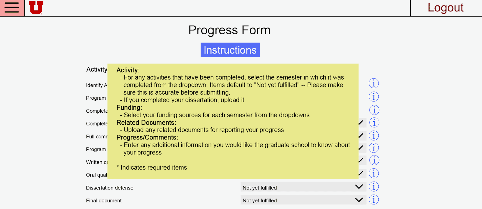
The first task had no good solution in the existing system—students were expected to cross-reference the handbook, CIS, and their advisor's memory. Our redesign consolidated requirement status, suggested timeframes, and course information onto a single landing page (the Progress Report), with completion status indicators and hover tooltips pulling course catalog descriptions inline.
For the progress form, the existing system gave students no guidance on what to write or who would read their submissions. We introduced a tooltip system: contextual info bubbles on each form section explaining its purpose, its audience, and what a good response looked like—without requiring students to leave the page.
Navigation was also split: separating "Progress Forms" and "Program of Study" into distinct menu items after early testing showed that a single "Forms" tab caused users to look in the wrong place.


Usability testing & iteration
Two rounds of usability testing, with roles rotating across sessions. The first round used undergraduate peers as participants after the paper prototype. No major structural problems surfaced—which was the result we needed to move forward with confidence rather than iterate on fundamentals.
The second round brought back the same three graduate students from our contextual inquiries to test the revised design after the digital mockups were complete. The most significant design change came from observation, not expert review. During a session, a participant went silent trying to understand a form field—a long pause that made the confusion visible in a way no interview question would have surfaced. That moment drove the addition of the inline Instructions button on the Progress Form.
Other findings that shaped the final design:
- Users couldn't distinguish editable fields from pre-filled ones → added visual shading and dropdown affordances
- The "Forms" navigation label caused users to navigate to the wrong page first → split into "Progress Forms" and "Program of Study"
- The Progress Report checklist wasn't read as a requirement tracker → separated Program Requirements and Track Requirements into distinct labeled sections
Cross-team heuristic evaluation feedback flagged inconsistency between menu item names and page titles—a violation of Nielsen's consistency heuristic that we resolved in the final prototype.
Digital mockups
The digital mockups translated the tested paper prototype into higher fidelity, with several refinements between stages: clearer visual separation between current and past Progress Forms (testing showed they were easy to confuse), expanded tooltip coverage, and external resource links embedded where students had previously needed to leave the system.


Outcome & results
Both rounds of usability testing showed participants completing the target tasks with substantially less confusion than they reported with the original system. The tooltip system received the most consistent positive feedback — participants noted it reduced their need to consult the graduate handbook mid-submission.
The redesign was never implemented; the deliverable was a validated design recommendation. After submission, we learned that some of the proposed integrations—pulling course data automatically from university systems — would face FERPA constraints we hadn't accounted for. The design held up; the implementation assumptions didn't. That's a meaningful distinction, and it shaped how we wrote the reflection.
Reflection
The most useful thing usability testing gave us wasn't feedback—it was silence. Watching a participant stop and stare at a form field told us more than any answer to a direct question would have. That moment changed the final design more concretely than our heuristic evaluation did. Iterative observation is the mechanism of improvement, not a methodological checkbox.
Two things I'd do differently. First, we didn't speak with the faculty responsible for GradTracker before designing. Doing so would have surfaced the FERPA constraints earlier and led to more implementable recommendations. Second, our advisor workflows were underexplored—some form design decisions couldn't be fully validated against what advisors actually needed from student submissions. Naming that limitation explicitly made the recommendations we could stand behind more credible; I'd push for advisor access from the start next time.
Think-aloud facilitation is also harder than it looks. Knowing when to let silence breathe versus when to prompt is a real skill, and we reflected on it explicitly as a team after the sessions.